
UX, UI Design Project - Redesigning the ATO website to help users find required information with great ease
The Australian Taxation Office (ATO) plays a large role in the Australian economy. The ATO's role is to effectively manage and shape the tax and superannuation systems to support and fund services for Australians. The goal of this project is to perform a redesign of the ATO's website, ensuring that users are treated to a managable site structure and pleasent viewing experience.
By first understanding the target audience, I was able to restructure the website's navigation and build new information architecture that directly enhanced the experience for the user, relieving potential pain points.
The ATO is used by Australians from many different backgrounds and ideaologies, so choices had to be made to suit many types of people. The ATO is a government agency and it sometimes felt limiting to implement a specific style system.
Adobe XD, Miro
3 weeks
The team consisted of:
William Russell - UX/UI Designer
My responsibilities were:
- Planning the project - defining scope, strategy
- Conducting user research (user interviews)
- Ideation - defining user insights & value proposition
- Information architecture - card sorting, site mapping
- Delivering solutions through UX Design methods and techniques interaction Design, wireframing,
prototyping, user testing and visual design)
Beginning with a choice of different govermnent agencies to redesign, I chose to redesign the ATO website after feeling
there was a distinct lack of style present. I wanted to re-imagine the colour system and streamline the main navigation options
for the user, as the website contains an extremely large amount of buttons and links. Of course, a website/agency such as this is
home to a mountain of information, so this is to be expected. Hence, my desire to try and simplify it for the user.
My method was to first understand what the user looks like and their goals on the website. Next, I defined what works on the
current ATO website and what needs to change. Through detailed information architecture, I planned the navigation system and then finally, I spent
time wireframing and prototyping at different levels of fidelity, iterating along the way.
I started by creating a proto persona named Oswald. Oswald is a 32 year old marketing manager, who is looking to manage his income in a stress free manner. He feels frustrated when his time is wasted using government websites such as the ATO, and does not enjoy tax time because of the time waste and confusion it brings.
Next, I ran five user tests of the current ATO website, gaining some mixed results in the process.
Users were given 5 tasks to perform across the website and asked to comment on their experience after each task, including their thoughts
on the overall design, gains and pain points.
1. How effeciently can users use on-screen links to find their needed page/information?
2. What stops the user from successfully arriving at their destination?
3. What components present pain points for the user?
4. At what point during the website flow can users get stuck?
Testers were concerned with the information they desire not being easily accessible, as information spread across the site through the
main navigation and sub navigation between pages felt "misleading" and "too broad". The sheer amount of information presented from the home page
was overwhelming for the users, and headers felt hard to use based on the information desired.
Users commented that the footer was very hard to use, with the amount of links presented feeling like a "wall of text", and some calling for it
to be "simplified".
I created a prioritisation matrix to organise the responses and understand what would be the most important to the user, and the government agency.
I decided the most usable parts of the tests were the text being accessable and clear and relevant information being present.
After user testing, I wanted to dive into the ATO website to gain insight of where any problems may lie, and where I could make a real difference. I started
with redlined annotation of some of the most used pages, including the home, individuals, tax return and what's new pages. I discovered issues with categorisation,
hierarchy, and the general ordering/flow. Calling back to LATCH principles, I sited many hard to understand sections present where headers and links did not follow
any set principles, leaving them to feel out of order and confusing. Check out my in depth annotations here: ATO Annotations
To dive deeper I defined certain user paths through the website, which all involved a high number of clicks and plenty of text to read through. In the flow below, the user
is looking to gain information on the Tax Free Threshold, and they find it through various pages using multiple navigations (top and side), and on page links. I felt this was too
many clicks for the user to easily find the information they were after, which was backed up in my user testing sessions.
Now that I understood the users needs and had insight into the sites potential problems, I went ahead with defining the information architecture.
I began with a card sorting exercise, taking all of the header navigation links and re-organising them to what I felt was the right choices for the user. The
exercise helped me see the need for redistribution of some sub categories, and the addition of the 'Tax' primary category.
I first grouped them into categories, distinguishing the key header links I would place into the website navigation.
Then, I grouped the categories into a mock-up site map, as you can see here:
As a result of this exercise, I was able to create the official sitemap that includes the primary, secondary, and tertiary navigation, as well as the footer. Present on the right are six links that come directly from the home page. The red dotted lined show directions for some pages that have multiple routes. See the site map here: Site Map
Once the information architecture was organised, I began to produce low-fidelity wireframes at a high volume. The low-fidelity prototype demonstrates the navigation between primary and secondary pages. It was built with LATCH principles in mind using heirarchy, categories, and alphabetical ordering when logical. See the low-fidelity prototype here: Low-Fidelity Prototype
I also created a low-fidelity mobile wireframe as I planned on making this design responsive across desktop, tablet and mobile. This design would lead to the high-fidelity prototype, which I built in the mobile format.
Looking towards mid to high fidelity prototyping, I began to create components for the primary and secondary navigation states.
They display the same LATCH principles from before, but with a bit more flair and organisation. They include default, hover, and toggle states.
The ATO is a website where people go to fulfill their tax returns, manage their business, and get knowledge about things such as super, non-for-profits,
and more. With the content being largely government based, I wished to keep some professionalism about the design, while adding some flair using more exciting
colour and type styles, more interesting looking elements, and more straight forward navigation.
The goal was to create a design system that represents the Australian Taxation Office in a professional and engaging manner.
View the complete style guide here: ATO UI Style Guide
As the finish line drew near, it was important to make sure the wireframe systems that I had put in place will work in a responsive manner.
These artboards show the RWD put toward the redesign, making sure this webpage version will be suitable to use across many devices where relevant users would frequent the site.
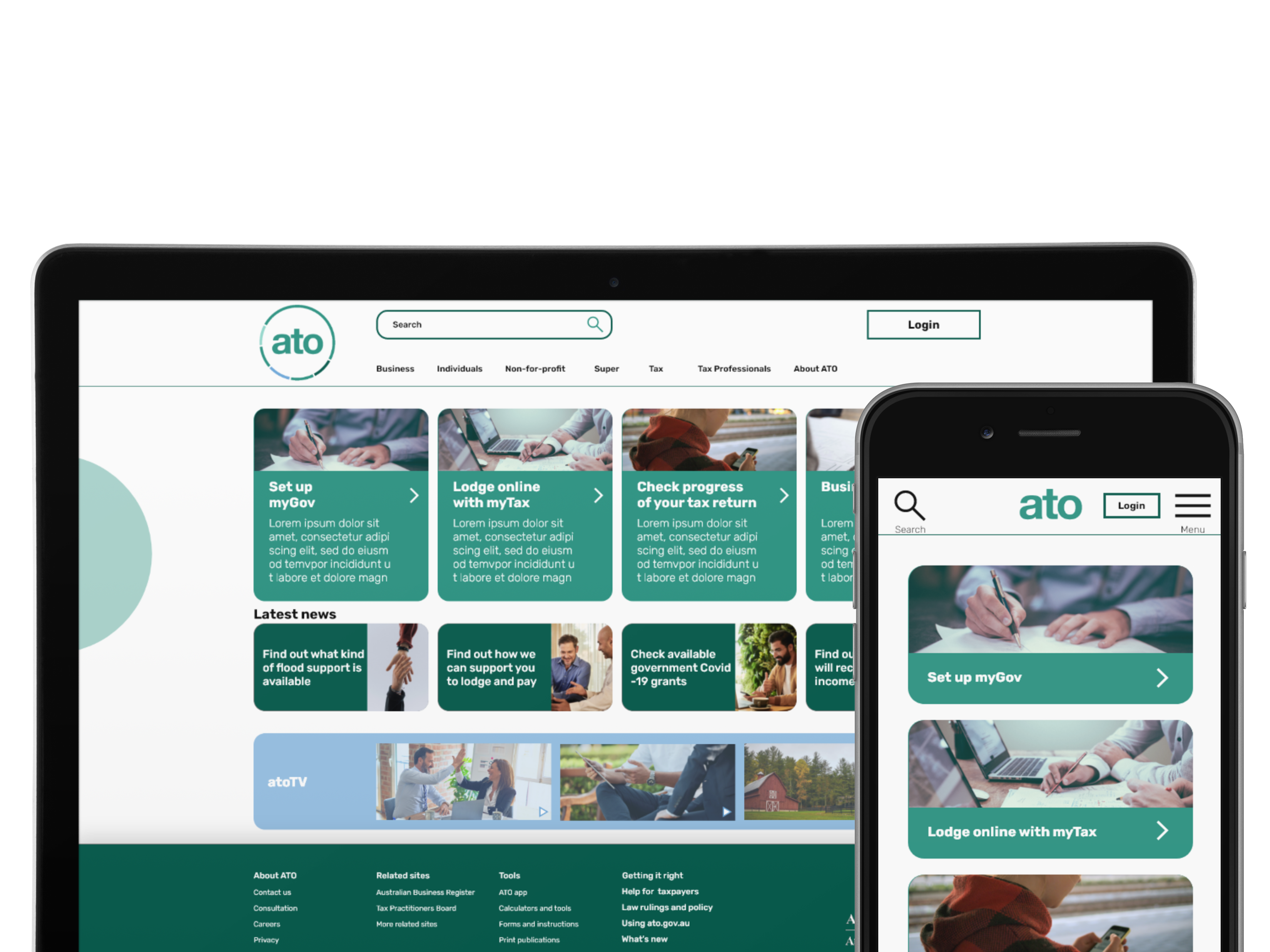
Off the back of the UI style guide being finalized, the RWD, and the various user testing completed, I arrived at the final high-fidelity designs for the ATO redesign.
Featuring a new colour scheme, a sleek card layout, and many elements that can be interacted with, the mobile prototype provides a look into how the information architecture is displayed throughout the website, and provides easy access to ATO information for users. Click through the mobile prototype here: High-Fidelity Mobile Prototype
Being my first redesign project, the thought of overhauling the ATO website with new site navigation and style was daunting. In the end,
this project helped me gain a lot of confidence in myself as there were times were I was doubtful of my own ability, especially when working on
elements like that site map on my own.
Creating a responsive web design is a crucial part of the UI Designers job, and this project made me believe in that statement. It was clear to me that
a mobile version would likely be the go-to way for users to experience the website, so I made the decision along the way to build out a prototype for mobile
instead. This gave me great practice in designing for different resolutions, and made me think hard about the type of containers that would be used across all
versions of the site.
Thank you for reading!