
UX, UI Design Project - Giving users quick access to products they need, while also benefitting local community
How often do you need to purchase a product as soon as possible, but are unsure where to buy it? Well, we set out to fix that problem with the Buy & Borrow mobile app.
Buy & Borrow is a search tool that allows users to save time and proactively support their local community. The app gives users instant access to product information such as price, stock levels and directions, all toward saving the user as much time as possible. Users can also borrow items from members of their local community in an effort to raise community spirit, and drive down user spending.
There is challenge in creating an app that has substantial value for users to be their main source for quick information over search tools such as Google.
Figma, Miro
3 weeks
The team consisted of:
Ellie Fan - UX/UI Designer
Jake McKeown - UX/UI Designer
Shannon Sempf - UX/UI Designer
William Russell - UX/UI Designer
My responsibilities were:
- Planning the project - Defining scope, strategy
- Conducting User Research (User Interviews)
- Ideation - Defining User Insights & Value Proposition
- Delivering solutions through UX Design methods and techniques (Interaction Design, Wireframing,
Prototyping, User Testing and Visual Design)
This project was the first major UX project for all of our team and we aimed to complete the project with strict methodlogy, as to not
get carried away with large scope. We began with research, making sure that we had enough feedback to validate our ideas. Through defining and
ideating, we nailed down our app structure and were ready to move into wireframing and prototyping. The goal of our methodology was to make sure
we covered all bases through the journey, and that started with out initial proto persona.
Creating our proto persona Mandy was crucial to beginning our journey through our methodology. After brainstorming, the group came to the conclusion
that people are looking to save time in their daily lives and would prosper if there was a tool availble to show them the closest location to buy their needed
items. This persona reflected (in our opinion) the average user for our app idea.
Mandy is a 35 year old occupations manager who is budget conscious, spontaneous and friendly. She doesn't like to waste money or time, and gains enjoyment when
supporting local business. She enjoys meeting new people, and is very talkative. If provided with our app idea, we believe Mandy would save time and money while also
being able to support her local community and meet new people.
As a user research team, we wanted to understand the way users access product information when in need, and the pain points that come with it. In the modern world, people
are living busy lives and are looking for more effiency. In an age fuled by online shopping, our team is looking to drive interest in local business by creating a platform
that gives people quick and reliable information about where they can buy their needed items close to their home.
The ideal participant for our testing would be living a busy lifestyle, leaving them poor on time. These participants would participate in in-store and
online shopping regularly, and have experience accessing information for their desired items online.
We ran five user tests.
1. What does our user look like?
2. What is the process a user usually takes when looking to purchase a product?
3. What challenges do people face when trying to source/purchase needed products?
4. How can we encourage people to shop locally?
5. Have people's views on shopping for products changed post-pandemic?
Our typical user is very time poor. Users want to be able to search for, and compare items before travelling to the store to purchase them. A major furstration for users is not being able to find accurate stock information. While users want to support local business they often do not know where they are located or what products they have to offer. Users were adament that they value in-store shopping now more than ever after the pandemic. We felt validated in our proto persona assumptions, while also gaining a lot of great insight into shopping pain points and what kind of information users value when shopping.
After our user interviews we used our data to complete this user persona. Olivia is a online school teacher, who juggles her time with being a mother
to 3 children. She is certainly poor on time, and values her time management more than anything. She tries to keep up a good social life, which gives her
incentive to shop locally and meet people in her community. Unfortunetely, she is finding it hard to meet new people post pandemic.
When searching for products, Olivia values quick and accurate information. She enjoys seeing the local economy thrive and it motivated to contribute when she can.
We believe our app idea will help Olivia which her budgetary concerns, help her manage her time efficiently, and provide her means to meeting, and supporting her local community.
During our research we discovered that due to the pandemic and
the resulting supply chain shortages many consumers are now
struggling to find which stores stock the products that they need.
Therefore, we believe that giving accurate stock information might
be able to help consumers if we present that information clearly.
We might do this by providing real tiem stock level to our users,
and giving them options to sort by distance. Doing this will allow our
pdocut to save time and energy for our users and their busy schedules.
Olvia needs a covenient, reliable and accurate way to locate and compare items she is looking to purchase so that she can feel satisfied with her purchasing decision, and spend her limited free time on the more important things in life.
We used a combination of brainstorming, competitor analysis and feature prioritisation methods to determine which app features would be best implemented in order to solve the problems highlighted by our user research.
Our Competitor Analysis showed that many sights included quick buying options for consumers looking for easy access
to product information, yet no competitor added any support for generating routes for consumers for accurate direcitonal information.
We felt it was important to understand which features would create an impactful experience for the user, so we created this Feature Prioritisation
matrix. This project was completed in a 3 week time period, so the team was challenged to manage the scope of the project and understand what the essential
features required for our solution really were.
We belived that key features to focus on would be making sure the app helps users find products efficiently and make sure they user will know
the exact route and location of the desired item, leading to more chances to support local businesses.
Using our key user insights and coming out of the ideation phase with a real sense of discovery, the team created this user journey map to display the users
path to app discovery, and then showccase how to app will aid the user in the situation.
In the scenario, Olivia is planning a family holiday that requires some extra shopping for essential items needed for the trip. Using the mobile app, Olivia
searches for her desired items and using the app, finds the information she needs and confirms the fastest route to get her shopping done so she can get back to her
busy life.
With the information we had collected and analysed so far, we came up with our solution. The Buy & Borrow mobile app would be created to serve users who are looking for quick access to shopping information such as price, stock levels and directions.
When planning our information architecture, we harkened back to our key users insights and remembered that users were looking to save time and energy to focus on the
more important aspects of their lives. In regards to that insight, we created a user flow that ensured users would be taking minimal steps after opening the app
to gain the information they need.
The user flow is split into three sections: buy, my lists and borrow. The 'buy' user journey relates to customers searching for products, and discovering the necesarry information
they need. From there, they can add items to create shopping lists for future need, thus saving even more time. Lastly, users are able to 'borrow' items from other members of their local
community by seeing location results of community members willing to help out.
While the user flow came quite large and complex, this simplified version shows the key points of the users experience with the app and the main features provided.
Our low-fidelity wireframes helped us entertain our ideas and see the them in action, while also grounding us and helping us learn what worked, and what didn't. This prototype was key for upcoming user testing sessions, where we would look to understand any outstanding user pain points.
Our main goal for this round of testing was to determine if the key features of the app added value in their current state, and identify through questioning what users felt worked and didn't work so
far.
User tests highlighted serveral features of the app that could potentially be improved. Due to time contraints, it was impractical to complete all of these. We decided as a team to collate this
data and organised it into a feature prioritisation matrix to align ourselves for the remaining time of the project window.
After our prototype testing, and calling back to our user research and key insights, we designed the high-fidelity prototype for the Buy & Borrow mobile app.
As we found out during testing, the home screen was the key for user guidance inside our solution. Our inital wireframes showed a map across the home screen, so users could find locations instantly. This ended up being too jarring for users during testing, who did not understand where to go when arriving. This variation of the home screen provides users with a recognisable search bar, distance slider, and easy to understand links at the bottom of the screen.
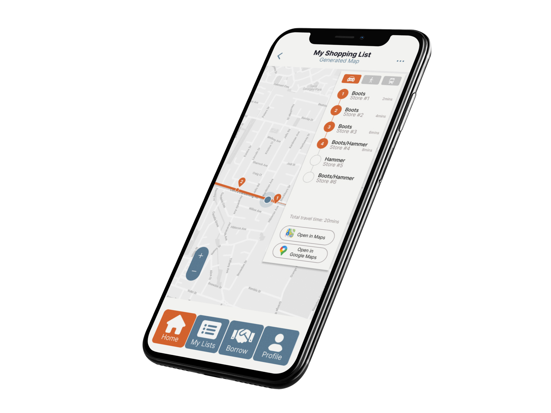
Here you can see an example of a multi-item route being generated by a user. We aimed to give users instant feedback of location information for items they needed, so this can represent an example of giving users a shopping route, and also keeping track of their progress.
To maximise user experience and time saving, we created a shopping list function so users could easily come back to items they need on a regular basis. There is an option to generate a shopping route from the list function, giving users the ability to save time and energy recreating their list from scratch each time.
Users are able to borrow items from local community members, saving money and meeting new people in the process. Users indicated a desire to be more involved in their local community during user testing. There is also an option to lend items, if users so desire.
Lastly, users are able to create a profile within the app and use a chat function to speak with potential borrowers or lenders from the local community.
To view and click through the high-fidelity prototype please use this link: Figma Prototype
Being the first project on my UX/UI journey it was an extremely important learning experience. Creating and bring ideas to the table alongisde other designers in a rewarding experience, and also
a challenge. Everyone is excited to bring their best work forward, but at the end of the day it is about having trust in your teammates, and great communication to keep the lines open and work through any
issues together.
It was an important learning oppurtunity during this projects middle portion where we struggled to understand our own idea. We cornered ourselves with a great deal of scope, and did not have the experience to
make the tough decisions on what features to keep, and which to put to the side. Fortunately, we came together strongly as a team and made a plan for the last act of the project and produced work we are all
very proud of.
Thank you for reading!