UX/UI Design Project - Raising awareness through a new & improved digital presence
Edgar's Mission is an Australian non-for-profit organisation that provides care to over 400 rescued farm animals. The goal of this project was to improve the digital presence of the redesign, resulting in higher donation, volunteering, and visitation rates.
Our idea was to combine all organisation's moving pieces into to one home. We wanted to create a hub people to view all possible options when interacting with the mission. while hopefully creating further reason for users to help the mission in any way they can.
The current website featured many branching paths that linked to external websites for things such as the shop and a donation portal. The challenge was to bring all avenues together seamlessly to create one website that felt connected in every way.
Figma, Miro
3 weeks
The team consisted of:
Aaron Power - UX/UI Designer
Leah N - UX/UI Designer
Rashin Rafiee - UX/UI Designer
Samantha Littman - UX/UI Designer
William Russell - UX/UI Designer
My responsibilities were:
- Planning the project - defining scope, strategy
- Conducting user research (user interviews)
- Ideation - defining user insights & value proposition
- Delivering solutions through UX Design methods and techniques (interaction Design, wireframing,
prototyping, user testing and visual design)
As a team, we first got together to brainstorm ideas for a possible redesign. We pondered where we could make a difference
and what issues spoke to us. Well, we all loved and cared for animals, so it wasn't long until we found Edgar's Mission.
Edgar's Mission had a website that was very dated, and didn't appear to have any clear information architecture or user flow.
So, we set out on this project with first defining our methodology that would carry us through. Or as I like to call it,
the game plan.
During our first session, the group invisioned our proto persona, Polly. Polly is a 28 year old Primary School Teacher who is health conscious, and a nature lover. We imagined that Polly would be a reflection of our potential user because not only does she care about animals and the environment, but she is actively seeking to assist in those areas and provide knowledge to her students. She is frustrated by poor treatment of animals and is looking for easier options for volunteering with the mission so she can plan her time ahead of schedule.
We set out to run user testing, hoping to gain some clarity on our proto persona and also gain some
valuable insight into our potential users and their pain points.
Our ideal research participant would be interested in animals, animal rights, and the enviornment.
We ran six user research interviews.
1. What does our user look like?
2. What motivates someone to donate to a non-for-profit?
3. How aware are people of non-for-profit organisations?
4. How can we encourage people to engage with non-for-profits more?
5. Have peoples's views in non-for-profits and donating to causes changed post-pandemic?
6. Which way do you prefer to donate?
Our testers were in agreence that visiting the farm help them take the next step in terms of engagement which we believed to be a key insight from testing. Users do believe it is important to donate to non-for-profits but they also wanted to trust them. Honestly and reliability from non-for-profits will bring in much larger engagement from the public. Users do believe that inspiring stories from the farm will help them feel more encouraged to make a donation.
After our user interviews, we completed an affinity chart and an empathy map on the way to creating this user persona.
Tash is a soft hearted person who is passionaite about making a difference from the environment and it's animals. She
has spent time volunteering to different causes since she was little and still tries to dedicate a good amount of time to
it now as an adult. Unfortunately, Tash finds it hard to manage her time between her teaching job and her social life and wishes
that non-for-profits would make information more accessible, and their online portals easier to navigate.
We belive our user persona Tash is motivated to help non-for-profits and that Edgar's Mission is suited to her lifestyle and
interests. If Tash can easily donate and register for volunteering through an online portal she will be able to
manage her time more efficiently and make a bigger impact.
Tash needs to donate to non-for-profit charities, because doing so will keep important causes running so she can feel at
ease about her beliefs.
During our research, we discovered people are more likely to donate to non-for-profit organisations that are honest,
realiable, and have a well established online presence.
We believe if more information is accessible at the right place for non-profit organisations and charities, the more
people and animals can relief and receive assistance.
Therefore, we believe that redesigning the Edgar's Mission website to improve booking functions for volunteering and
visits, donation pages, and style, will help users efficiently discover ways to engage with the Mission, and therefore be more likely to raise more awareness as a result.
After creating our user persona and determining our key user insights, we established this leading statement to guide us towards our goal:
To begin our ideation phase we set out to define where the importance lies within the website, and what journeys our users will be
taking within.
We began with a Site Analysis of the Edgar's Mission website.
We discovered that while the website had clear information available, you had to dig for it. The site navigation was very unclear to users and
there was no sense of specific information architecture to aid users at all. The site was in desperate need of a visual overhaul, with no clear style direction
in terms of font type or size, and colour distribution.
Our Competitor Analysis showed that many websites were struggling to find the right balance of stylish visuals and engaging content.
All sites by Animals Australia had varying sizes of text, and 50% of sites lacked the clear information that users desire.
It was clear that we needed to focus on creating a design system that commited to a bold style, with clear navigation and information key focuses also.
We felt it was important to understand which features would create an impactful experience for the user, so we created this Feature Prioritisation
matrix.
We belived that key features to focus on would be the donation and volunteering portals, visuals and making the site mobile friendly.
This User Journey Map provides key information about Tash's journey through the Edgar's Mission website and describes when and why certain
actions will provide different emotions. With this map, we can predict at what stages of the user experience will provide gains for Tash and when will
potentially cause any pain points.
Using the map, we believe that there is oppurtunity to enhance the user experience by providing tools to the user when necessary.
The ideation phase helped us understand what next steps to take to ensure that the user experience that is being targeted will be provided. We learnt that
there is a lack of clear information throughout non-for-profit websites and that building strong information architecture can help provide support to users
trying to find the information they need.
We believed the solution for our redesign is defined by these characteristics:
- Organised information architecture
- A style guide that tells the right story and is visually appealing
- Clear information and instruction when donating or registering to be a volunteer
Our idea was to build user portals for the donation and volunteering streams that, while still staying on the website, served as their own small hubs of information
relevant to the users needs.
With our vision now clear we first built information architecture.
The current website included many navigation options from the top nav-bar and we wanted to simplify it for the user, while keeping the most important
aspects grouped together and still easy to find. The six navigation options below were chosen to suit user needs based on our research and also to provide
the most essential options for engagement, sich as donation and volunteer.
Links previously found within the top nav-bar, such as the blog, shop, and events, were now moved to the bottom of the page, being feautured on their own
cards.
Our defined user flow provides easy access to the most common functions of the website to the user and streamlines each process as it's own small journey.
Low-fidelity wireframes helped us put our initial design throughts to screen and commit to our defiend information architecture. While representing no style yet, these wireframes helped us gain great insight and feedback through user testing sessions.
Users were given 5 navigation based tasks to fulfill during our user testing sessions. We narrowed down the test results to these key findings:
- We needed to match all graphics and typography across the website as there was a bit of misplacement
- Interactive states to be added for the portal tabs to cause less confusion
- The graphics and styling could be more welcoming
- The header banner was too large
With these iterations to be worked on, we dove straight into our high-fidelity prototype.
Our high-fidelity prototype was being built with two things in mind: style and substance. We needed to nail our information architecture, while producing a style system that does the mission justice and is provides a pleasing experience for the user.
Inspiration for our style guide came from colours of the Australian landscape. While that was the inspiration, we still wanted to colours to be inviting ot the user, so the colours
are of a softer tone. We determined the typical use for each colour in our system, with Eucalyptus being the main colour across the website.
We settled on the use of two distinctly different yet complimentary fonts in the heavy and square font Lora complimented by the use of Nunito as softer, rounder body text which
is easy to read without being comical or overly soft. Our user testing yielded positive feedback regarding the use of Nunito as a body style and the use of Lora as an attention grabbing
headline style was well received.
View the complete style guide here: Edgar's Mission UI Style Guide
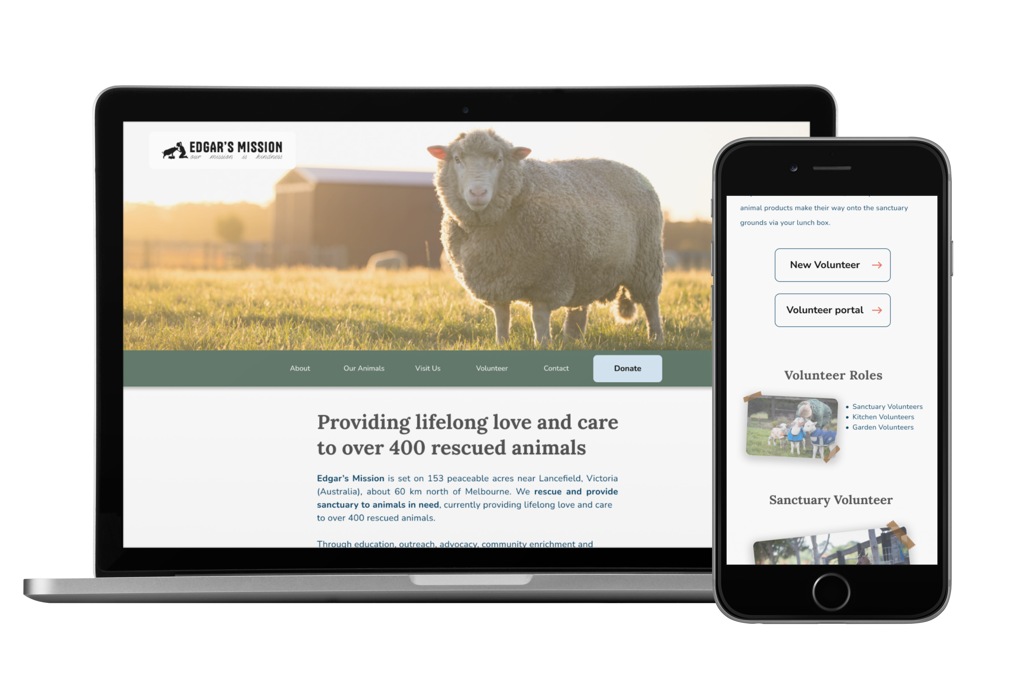
Based on user testing feedback, and our completed style guide, we settled on a design that we believed fit the mission's personality and creating a pleasing experience for the user. Pictures were made to look stuck down in an effort to make the website have a more home-like feel, with the idea that the website is a scrapbook. Here is the home page design:
And here are final designs for the volunteer and donation portals:
We wanted to highlight all of the wonderful animals that live at the mission and give the users an oppurtunity to browse the animals online before they head out to meet them, or even adopt them. Adopting animals was a key highlight of our intitial user research which was well recieved so it was essentially we kept it in the final design.
Users can use the donation portal to donate directly to the mission using a set amount, or setting up a recurring donation. This flow was created to provide the easiest experience donating to the user and we added a stepper to make sure the user understands where on the website they are at all times.
For the volunteering stream, we wanted to focus on providing the user with a tool that gives chance to better time management and oppurtunity. Using the portal, users can check upcoming events at the mission, read mail and newsletters, and create their own profile so the mission and others in the community easily can identify them.
In a similar fashion to the volunteering portal, we wanted to make sure users could easily understand when visits were available, and be able to best find a time to visit that both accomodates themselves, and the mission.
To view and click through the high-fidelity prototype please use this link: Figma Prototype
As stated in our feature priorisation matrix, we wanted to make sure we came up with a mobile friendly design. While our focus for this project was largely the website redesign, we made sure to create some high-fidelity mobile screens to display responsiveness, and show a glimpse into the future of the website.
This project was extremely rewarding and gave all of us confidence in our design skills moving forward. We learnt a lot about teamwork and how to best communicate with others in the
design space. I learnt the importance of a strong style guide and system, as websites filled with lots of different types of variation need consistency in the design to properly get
across to the user. This website features multiple flows and without a consistent design system, it would simply be too overwhelming for the user. And finally, I believe this project
helped me get a better understanding of how to tailor designs to the needs of the user, particularly through use of information architecture.
Thank you for reading!