
UX, UI, FE Design Project - Helping people connect with others through giving back to their community
The Impact App is the culmination of various brainstorming sessions, ideation, research and iterations. The goal of this project was to perform a redesign for the 300 Blankets website, a non-for-profit cause in Melbourne, Australia, improving awareness and engagement with the cause in the process.
Our idea was to create a platform where users could not only register to engage with the cause through volunteering, but also learn essential skills and connect with new people.
The current 300 Blankets website showed no signs of direction to the user and lacked resources for information and steps to take for help. The challenge was present relevant information to the user in a way that made sense, while also rebranding the 300 Blankets website with a new, refreshed style that would draw in more users.
Figma, Github, Miro, Visual Studio Code
3 weeks
The team consisted of:
Karnika Joshi - UX/UI Designer
Kim Jeff Dela Cruz - UX/UI Designer
Michelle Fiebiger - UX/UI Designer
Sophiya Kunjumon - UX/UI Designer
William Russell - UX/UI Designer
My responsibilities were:
- Planning the project - defining scope and strategy
- Conducting user research (user interviews)
- Ideation - defining user insights & value proposition
- Delivering solutions through UX design methods and techniques (interaction design, wireframing,
prototyping, user testing and visual design)
Beginning with brainstorming, the group spoke about various issues that they felt passionately
about, before choosing homelessness as it felt relevant to Melbourne. Upon researching local causes, we
came across 300 Blankets, a local non-for-profit that is dedicated to supporting people experiencing, or at risk
of homelessness in Victoria. From here, we determined our methodology for the project, and got to work.
Our intitial proto persona, Gabriel, was a 35 year old salesperson who cares about his local community. Gabriel likes to give back to his community, but sometimes feels unsure about how to get involved. He would love to connect with friends and others during this venture.
We set out to run user testing, hoping to gain some clarity on our proto persona and also gain some
valuable insight into our potential users and their pain points.
Our ideal research participant would have a keen interest in helping non-for-profit causes in various ways
(volunteering, donating). The participant would have a good understanding of what a non-for-profit is and have
some experience engaging with them.
1. What does our user look like?
2. What can motivate someone to engage with a cause they believe in?
3. How aware are people of non-for-profit organisations?
- What will assist in bringing greater awareness?
4. Do you engage with non-for-profit causes?
- If so, in what ways?
5. How aware is the user of homelessness rates in Australia?
6. In what ways can homelessness be helped?
While our users are aware of non-for-profits and their impact, they are largely unaware at not only
the correct way to engage directly with them, but also what to do if they are volunteering. All users
believe that awareness for non-for-profits can be improved through use of marketing and social media.
Users would be interested in volunteering, but are more likely to get involved because of time restraints. Users
believe if there was more information on how and when to volunteer they would be more likely to engage.
Users are looking for connections, and would be more obligated to engage with a non-for-profit if they were better
connected to the community.
After our user interviews, we completed an affinity chart and an empathy map on the way to creating this user persona.
Gabriel is looking for the chance to learn and connect with like-minded people, and gains happiness from contributing
positively to the community. Unfortunately, he finds it hard to find time to be more engaged, and feels unaware about
how to be involved.
Once we created this user persona, we established that our user is certainly motivated to help his community, but needs
to feel like he has a good understanding of what is needed of him, and when he is needed.
"I am aware of the issue of homelessness and would like to get involved to make a difference in people's lives, but it's
not always clear to me on how I can help people in need."
"I admire the work that non-for-profit organisations do and their positive impact to the community, but it seems to me
like they have everything organised already and I don't know how to contribute."
"I think connecting with others is a great idea, but I would need to learn ways of how to communicate effectively
with people before I feel confident to approach anyone on the streets."
"Having empathy and being aware of your surroundings is the most important starting point when deciding to help, but I
also fear that more funding is needed to make real change."
After creating our user persona and determining our key user insights, we established this problem statement to guide us towards our goal:
Driven towards sketching and wireframing, we started ideating to determine our best course of action going forward and understand the value of our product.
We began with a Competitor Analysis.
Through our competitor analysis of related non-for-profit websites, we found that many did not feature easily available and clear information about their cause,
or how to volunteer and get involved.
We next tackled Feature Prioritisation, using a brainstorming sessions ('I like', 'I wish', 'What if') to determine key features for
our users.
Key features we chose to focus on, based on their priority and overall effort, were connecting with friends and others, skills assessment,
raising awareness and rewarding users for their efforts.
By understanding which features to prioritise and having gained our key user insights, we created this Value Proposition Canvas.
It features the products provided by 300 Blankets, and gives substance to what helps create user gains and pain points.
This is a key part of the story of our product.
Finally, this Storyboard was created to showcase our user's journey to using the product, providing key motivations and context.
In this story, Gabriel feels compelled to help in his local community after seeing first hand the homelessness issues currently present, but he
is unsure how to best proceed.
He finds the 300 Blankets website, and is pointed towards the Impact App where he can not only register to volunteer, but also learn important
techniques on how to act and engage while trying to help.
He attends an event and uses his newly found skills to help, making new connections in the process.
After our ideation phase, we came to the conclusion that a mobile app would be the most viable solution for the user pain points
established during our research phase. This is because:
1. Our users are time poor and would benefit from using their smart device for quick and easy access.
2. Users are accustomed to using mobile apps and would be able to navigate the app interface with relative ease.
3. Online connections with friends and others are carried out on mobile devices frequently in the modern age.
4. An app can be a great connecting tool for the 300 Blankets organisation, bringing in more engagement and awareness.
Alongside the Impact App, we decided to complete a front end development redesign of the 300 Blankets website, with the idea that the
website will directly call out to the mobile app, creating a multi-modal experience.
This simplified version of the user flow promotes a connection between the website and app.
To see the complete user flows for each section, go to: User Flows
We created low-fidelity wireframes to capture the structure of the app, confirm our user flow between screens/sections and work out strategic placement of interactive components and buttons.
Following the development of our low-fidelity prototype, we held user tests with six easy tasks, where we tested
basic functions and navigation of the app such as onboarding, registering for events, training, and using the chat function.
Users enjoyed our concept, and believed the app did function well except for some minor changes needed. It was encouraging to get a positive reaction for our first tests. Here is some of the important feedback we recieved:
Based on what we learned during our user testing while also reflecting on our user persona and key insights, we made alterations to the low-fidelity screens and moved ahead with the high-fidelity phase. Our goals for this phase were to bring our product to life with visual flair, as well as improve upon the testing results and create a product that serves all of our users' needs.
Our style guide came together across the three weeks of the project and focused on colours inspired by a blanket. Of course, this reflects
on the 300 Blankets organisation and their initiative to provide blankets to those in need. While the primary colour scheme was bold, we chose to use
lighter version of these colours for the application, providing a softer viewing experience for those using the app frequently.
The Impact logo was designed to portray a fun and engaging character, while feeling bold and determined.
View the complete style guide here: Impact/300 Blankets UI Style Guide
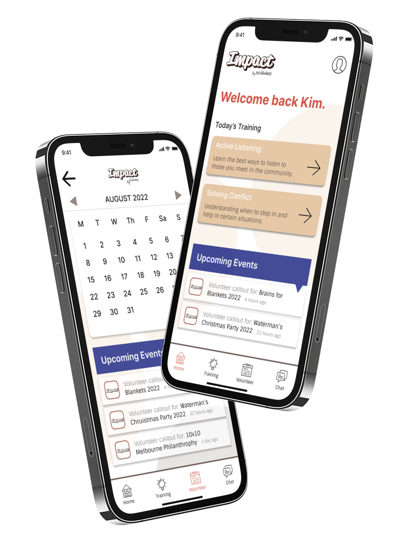
Based on user testing feedback, and our completed style guide, we came up with the following high-fidelity screens:
We designed a feature where users can learn essential skills for volunteering, such as active listening, awareness, and more. This feauture was chosen to directly aid users with pain points releting to lack of awareness and skills. Users complete training modules to gain knowledge, then take a quiz to earn their completion badge.
Users can use the in-app calendar function to register for events, check upcoming dates, invite connections, and more. This feature was integral to the design of the app, as many users were not aware of upcoming events from the non-for-profit, and had limited time to commit to volunteering.
During research, we discovered that users would be more likely to commit time to engaging with non-for-profits if they made connections with like-minded people. As part of the Impact App design, we chose to build upon that idea with a friends & chat section, where users can connect with those they meet on volunteering sessions, and chat with them about further events.
To view and click through the high-fidelity prototype please use this link: Figma Prototype
We also created a front-end build of the resdesigned homepage and Impact App page of the 300 Blankets website which you can view here: 300 Blankets Homepage
This project was a fantastic learning experience for me and a fantastic culmination of all of the hard work put in throughout the
Monash University UX/UI Boot Camp over 7 months. Creating a multi-modal product was challenging, but rewarding. I learnt a lot about
project scope and how to manage your work load, especially with fixed time frames for completion. I learnt the importance of prioritising
features for the MVP, as many ideas were pushed aside during this project so we could nail the most important aspects that would benefit the user.
This project took plenty of teamwork, focus, determination, and resolve to complete, and I am very proud of the outcome for the entire group.
Thank you for reading!